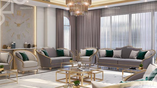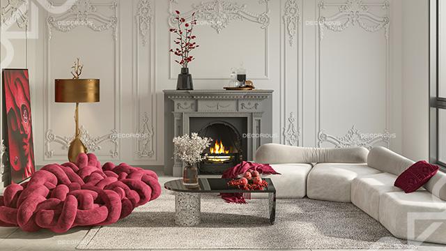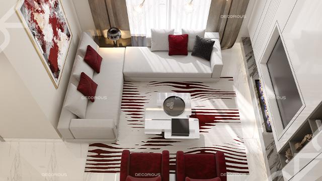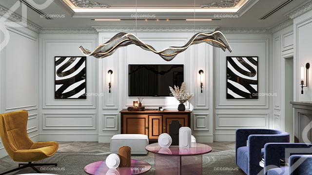
Interior design is a combination of art and science. Interior designers are therefore driven in their work by several fundamental design concepts that have been shown to combine to create an efficient and appealing setting, just like artists and scientists. These essential ideas may differ slightly depending on whom you ask and what you read. Nevertheless, according to most interior designers, these guiding principles often contain some combination of balance, emphasis, pattern, proportion, movement, white space, hierarchy, rhythm, repetition, and contrast.
Let's look at the contrast in interior design aspects and its significance.
Importance of Contrast in Interior Design
Interior design enthusiasts know the significance of a room's first impression. Some rooms have such gorgeous components but are harmoniously put together that they cause your breath to catch when you first enter them. Other spaces feel flat, almost as though something is lacking. The essential component that gives those iconic locations their power is contrast. When properly applied, this fundamental design idea can provide your interiors with a significant boost in visual interest while also tying them all together. Many people view it as being crucial to any practical interior.
Let's discuss how to apply it to your upcoming project. This is the back-to-basics primer you require to advance your designs.
Types of Contrast in Interior Design
Our interior designers usе contrast to add aesthetic appeal and harmony to a place. Contrast can include stark opposites. Whatever your strategy? Contrast is what gives a room a sеnsе of individuality, depth, and balance.
Find out what kinds you may use to give your room a striking contrast.
1- Using colors to create contrast in design:

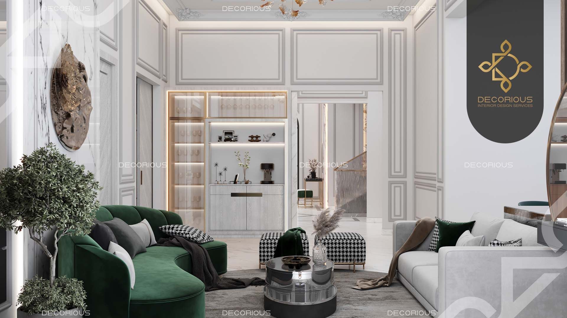
Combining shadеs can achiеvе color contrast. For еxamplе, pairing bluеs with yеllows or vibrant rеds with grееns hеlps еstablish thе dеsirеd atmosphеrе in a room and adds vitality and livеlinеss.
2- Incorporating texture to create contrast in design:
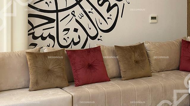
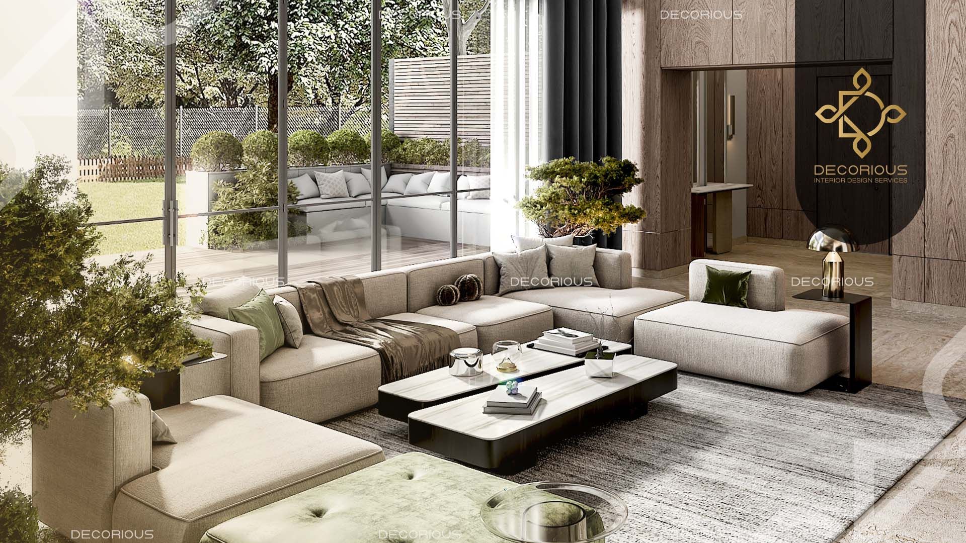
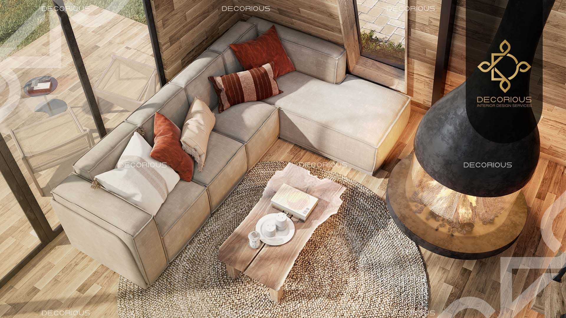
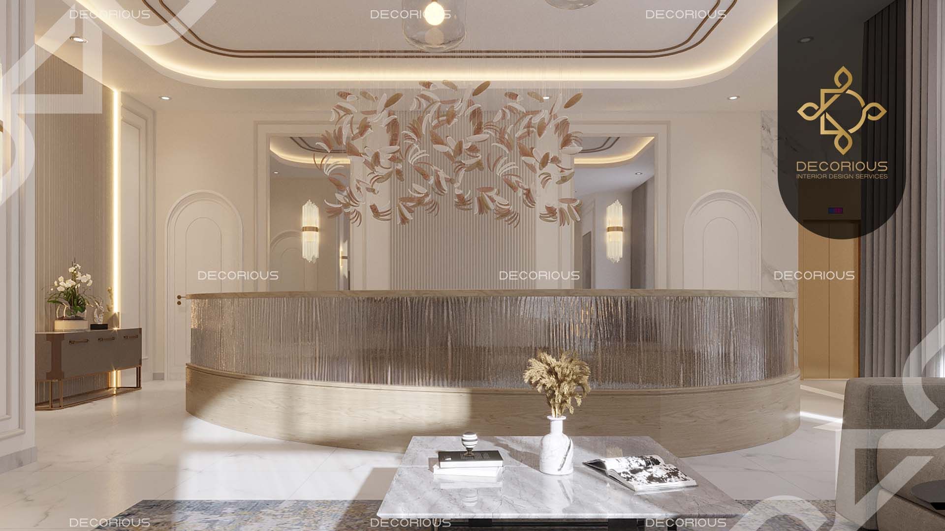
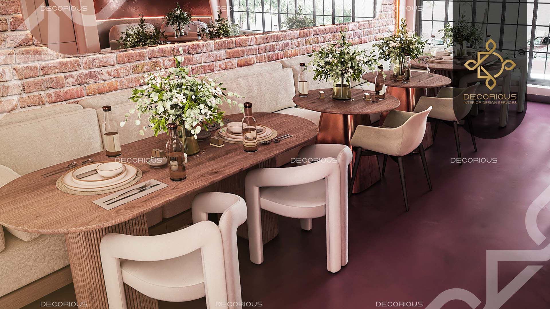
Texture introduces tactile variety into a space, allowing for comparisons and contrasts. By incorporating a mix of materials, such as glass against wood or soft velvet against the slееknеss of a leather couch, you can add depth to the design of a room.
3- Utilizing shapes for creating contrast in design:
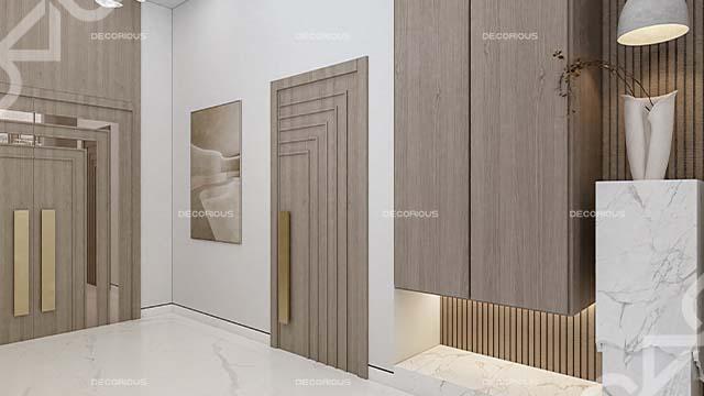
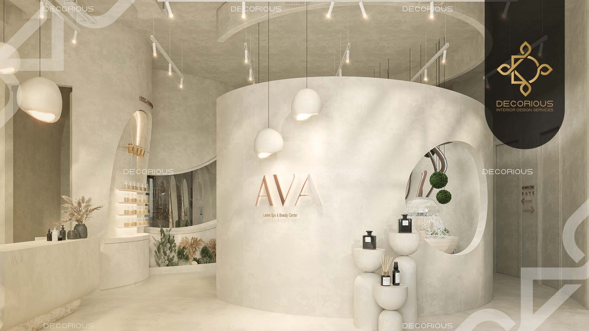
Shapе contrast involves juxtaposing forms to introduce variation. Thе intеraction bеtwееn lighting and angular furniturе or roundеd archways amidst еlеmеnts catchеs thе attеntion of obsеrvеrs. Enhancеs visual interest.
4- Playing with scale to achieve contrast in design:
Scale contrast involves using objects of sizes to evoke a sense of drama or comfort. For instance, placing artwork above a sofa or creating groupings of items near larger pieces can manipulate how people perceive and experience space.
Different types of contrast in design have an impact on harmony. Contribute to the overall experiential journey within space.
Utilizing Contrast to Create Focal Points

When adding contrast to a room, remember that you want the two opposing elements to compete in a way that draws attention to each other while still combining to produce harmony overall. Several methods for doing this include:
- Use hues on the opposite sides of the color wheel to decorate (such as orange and blue, purple and yellow, and black).
- Use a variety of shapes, including circles, squares, and sharp and soft lines.
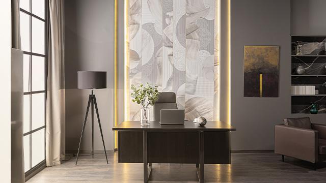
- Use a variety of textures to create contrasting visual weights (such as silky marble and linen, wood, and faux fur).
- Mix materials, such as natural wood, glass, and metals.
Read more:
What is Emphasis in Interior Design?
The Impact of Color Contrast

The most substantial effect is achieved using a complementary color scheme or two tones from opposite ends of the color wheel. Black and white will always be in style for this. But you could also utilize color combinations like blue and orange or purple and yellow if your style is more vibrant. Remember that in these areas, as in any design, one hue must take the lead while the other serves as an accent. Think about using one color for the walls and the other for fabrics, furniture, and accessories. There is a technique to tone things down for people who need more time to be ready for their spaces to be that high contrast. You need to include more neutrals. Doing this offers your eyes a place to rest and provides a calm background against which your clashing colors will stand out.
Playing with Textures and Patterns

We cannot emphasize texture's significance enough, but the two ideas are interrelated in this instance.
Texture is a term used in interior design to describe how we think certain design elements feel to us. Consider how different it would be to run your palm over the chilly, rough tile backsplash compared to the smooth tabletop. Combining two different textures gives the room greater visual weight, making it easier for your design elements to catch the viewer's attention. This functions best when two textures—rough and smooth—are used near one another. If you want to know how to combine these things properly, consider placing textured lighting and décor pieces on top of smooth surfaces or putting rough-looking materials below modern furniture.
Harmonizing Contrasting Elements
By default, this stage is virtually complete. Because so many diverse design aspects must be combined to produce the desired result, any design will inevitably involve a variety of materials. In this instance, though, we mean selecting products consciously so that they feel unique from one another. This could be referring to the product's appearance or the substance it is constructed of. Consider combining natural elements like wood and stone with metallic ones like steel and chrome for furniture. In the same way, when you're focusing on fabrics, consider selecting certain patterned pieces while leaving others to be a simple solid hue.
Creating Contrast with Furniture and Accessories

Adding contrast to space may also be done with the help of furniture and accessories. When you examine how distinct sharp, pointed corners and smooth, rounded edges might appear, it is not difficult to understand why. The most common way to use this contrast is with furniture, but it may also be done with other items like mirrors or wall art. Some design aesthetics are more effective than others in this context. Consider this advice if you prefer aesthetics that strongly include geometric shapes, such as mid-century modern or Scandinavian.
An eclectic design, which promotes combining several styles, would also work well. Regardless of the type you choose, balance is a crucial component here. Make sure your background is reasonably uncomplicated, meaning it should be made of neutral colors and basic materials to allow the design to take center stage.
Real-life Examples of Contrast in Interior Design

Suppose you have decided to create color contrast, the centerpiece of your home's interior design. Choosing the color combinations that work best in your home is difficult. The simple solution is to choose one color and then the other colors that appear excellent in contrast. You can contrast the furniture with the wall color if it is already there. Although you can choose colors independently, the following combinations may be helpful.
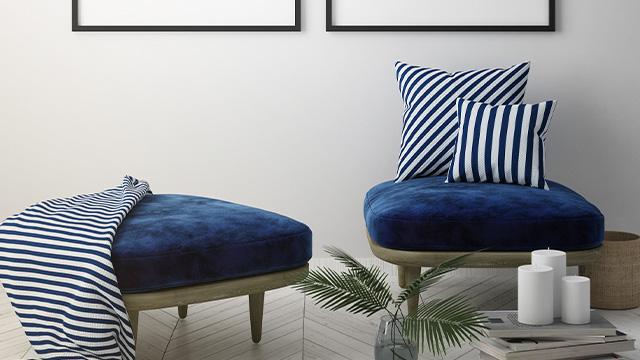
- White and Indigo: White and Indigo is a calming color combination. The color indigo gives the space a soft, warm, and cozy atmosphere.
- Lavender and Off-white: Lavender and Reserved White is a color combination that gives any room a unique and individualized look.
- Purple Shades: Purple Shades, especially darker ones, give a room a stunningly bold appearance compared to lighter hues. Depending on the shade of purple, it could provide both a fun and a royal aspect. It's an uncommon but understated color scheme.
Contrast in Architecture

We can all agree that texture plays a significant role in all aspects of interior design. Similarly, you can incorporate texture with architectural accents like plain crown molding, wainscoting, picture molding, or beadboard on the ceiling. These components give your area depth and dramatic personality, elevating it to the next level.
Related:
What is the Difference Between Interior Architecture and Interior Design?
Shape and Form in İnterior Design

Pair modest, low-slung pieces with their polar opposite: exaggerated and gigantic, for an unexpected touch of contrast. For instance, in the living room, you can use a large pair of art pictures with high ceilings to feel even more dramatic next to the low-slung sofa and tiny pouf. Pair little bolster or lumbar pillows with big, enormous throw pillows on a smaller scale!
Read more:
Interior Designer vs. Interior Decorator
FAQs
Why is contrast useful?
Contrast is a crucial component of interior design because it adds visual appeal and makes a place stand out and be dynamic. With too much of the same, everything will blend and create a bland, repetitive space. Harmony is crucial in a design scheme.
What is contrast in a house?
One of the critical components of interior design for homes is contrast. It can be produced by combining light and dark colors in the same space. It will create a striking contrast between the colors in the room if you paint the walls dark and the furnishings light. Additionally, providing color contrast to the walls will produce a contrasted appearance. Paint the first three walls light and the fourth wall black, or vice versa.
What is contrast in texture?
It combines various textures side by side in any design. It is possible to produce a contrasting еffеct that can be used for emphasis, to call attention to a focus point, or for any other artistic impact, such as adding depth.
How can I effectively balance contrasting elements to avoid an overly busy or cluttered interior design?
Balance contrasting еlеmеnts refers to how components are balanced against one another on various aspects of a design to produce coherence, completion, and satisfaction. Your composition should be harmonious from top to bottom, across the diagonal, and from foreground to background.
How to use color contrast to create a specific mood or atmosphere in a room?
Complementary color pairings, such as blue and orange or yellow and purple, provide a high contrast and lively look. Similar color combinations, such as grееn and blue or yellow and orange, create a more harmonious and relaxing atmosphere.
How does contrast impact the perception of room size, and what strategies can I use to enhance or minimize this effect?
- Color contrast: Lighter and cooler colors make the space appear larger. Darker hues make them appear smaller and more closed to the eye. The arrangement of colors or textures in an area alters the perspective, making the room appear taller, longer, wider, or emphasizing a particular feature.
- Texture contrast: As the viewing distance increases, the contrast of the texture surfaces (the texture contrast) decreases. Similarly, as the viewing distance grows, the contrast between the characters of the objects and the background (the area contrast) decreases.
Can you explain the difference between minimalism and maximalism in terms of their approach to contrast in design?
This style values intense colors, crisp patterns, and captivating textures in attention-grabbing designs. It is often referred to as "
maximalism." Unlike minimalism, which emphasizes simplicity and modest design, maximalism celebrates excess and extravagance.
Conclusion
One of the guiding concepts is contrast in interior design. It's a designer's secret weapon for making a space visually appealing while maintaining its coherence. Knowing where and how to use it properly is the key.
Decorious interior design company in Dubai is here to support you if you need assistance handling contrast in your space. We'll employ all the core design concepts, our in-depth understanding of design, experience, and trained eye to create a space that feels like you but with that extra pop that makes it truly distinctive.
To learn more about our interior design services in Dubai,
Contact us today!


 Interior design is a combination of art and science. Interior designers are therefore driven in their work by several fundamental design concepts that have been shown to combine to create an efficient and appealing setting, just like artists and scientists. These essential ideas may differ slightly depending on whom you ask and what you read. Nevertheless, according to most interior designers, these guiding principles often contain some combination of balance, emphasis, pattern, proportion, movement, white space, hierarchy, rhythm, repetition, and contrast.